Optimizely Advanced ContentArea Renderer is Back!
If you have used EPiBootstrapArea package - then back in those days we had an opportunity to render Episerver ContentArea items with different DisplayOptions based on Twitter’s Bootstrap framework grid system.
EPiBootstrapArea over the years lost its connection to Bootstrap framework and became general purpose advanced ContentArea renderer (with an option to set Boostrap grid system’s well-known classes).
Recently I got a call from fellow OMVP asking about whether they would be able to upgrade CMS11 project using EPiBootstrapArea package to CMS12. At that time I had no plans to upgrade it (as I saw that demand for Bootstrap package was declining). However, upgrade path was not that hard. So I decided to give it a shot.
As I wanted to get rid of Bootstrap “heritage” - this was a good timing to rename the package. So let me introduce Optimizely.AdvancedContentArea.
Getting Started
You need to install package from Optimizely’s NuGet feed to start using Advanced ContentArea renderer:
1
> dotnet add package TechFellow.Optimizely.AdvancedContentArea
Next you would need to configure renderer by adding it to the application and specifying display options:
1
2
3
4
5
6
7
8
9
10
public class Startup
{
    public void ConfigureServices(IServiceCollection services)
    {
        services.AddAdvancedContentArea(o =>
        {
            o.DisplayOptions = DisplayOptions.Default;
        });
    }
}
Or you can add your own diplsay options:
1
2
3
4
5
6
7
8
9
10
11
12
13
14
15
16
17
18
19
20
21
22
23
24
25
26
27
28
29
30
31
public class Startup
{
    public void ConfigureServices(IServiceCollection services)
    {
        services.AddAdvancedContentArea(o =>
        {
            o.DisplayOptions = new List<DisplayModeFallback>
            {
                new()
                {
                    Id = "three-fifth",
                    Name = "Three fifth (3/5)",
                    Tag = "displaymode-three-fifth",
                    ExtraExtraLargeScreenWidth = 7,
                    ExtraExtraLargeScreenCssClassPattern = "col-three-fifth-xxl-{0}",
                    ExtraLargeScreenWidth = 7,
                    ExtraLargeScreenCssClassPattern = "col-three-fifth-xl-{0}",
                    LargeScreenWidth = 7,
                    LargeScreenCssClassPattern = "col-three-fifth-lg-{0}",
                    MediumScreenWidth = 12,
                    MediumScreenCssClassPattern = "col-three-fifth-md-{0}",
                    SmallScreenWidth = 12,
                    SmallScreenCssClassPattern = "col-three-fifth-sm-{0}",
                    ExtraSmallScreenWidth = 12,
                    ExtraSmallScreenCssClassPattern = "col-three-fifth-xs-{0}",
                    Icon = "epi-icon__layout--three-fifth"
                }
            };
        });
    }
}
Configuration
Following configuration options are available:
| Name | Default | Description |
|---|---|---|
DisplayOptions | Empty list | Specify list of display options available for the renderer. Later editors will be able to choose any of these options while creating content and specifying dispay option for blocks. |
RowSupportEnabled | false | Configure if advanced content area renderer should support row option. |
AutoAddRow | false | Configure renderer to add automatically row CSS class to each new row div element. |
ItemStartRenderCallback | null | Callback to use to modify start tag for the content area items. |
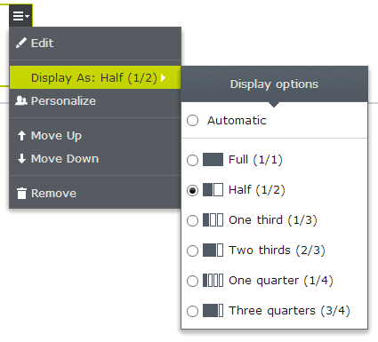
Available Built-in Display Options
Following display options are available by default (via DisplayOptions.Default):
- “Full width (1/1)” (
displaymode-full). - “Half width (1/2)” (
displaymode-half). - “One-third width (1/3)” (
displaymode-one-third). - “Two-thirds width (2/3)” (
displaymode-two-thirds). - “One-quarter width (1/4)” (
displaymode-one-quarter). - “Three-quarter width (3/4)” (
displaymode-three-quarters).
Usage
Once you have configured available display options for your Optimizely Content Areas, usage is pretty straight forward - just choose appropriate display options for each item in the area:
Display Option Fallbacks
For every display option there are 6 fallback width for various screen sizes based on Bootstrap grid system. According to Bootstrap specification following screen sizes are defined:
- Extra extra large screen (>= 1400px,
-xxl-) - Extra large screen (>= 1200px,
-xl-) - Large screen (>= 992px,
-lg-) - Medium devices (>= 768px,
-md-) - Small devices (>= 576px,
-sm-) - Extra small devices (< 576px, None)
These numbers are added at the end of Bootstrap grid system class (for instance 12 for Large screen -> 'col-lg-12')
| Display Mode Name | Extra small devices | Small devices (sm) | Medium devices (md) | Large screen (lg) | Extra large screen (xl) | Extra extra large screen (xxl) |
|---|---|---|---|---|---|---|
| Full width | 12 | 12 | 12 | 12 | 12 | 12 |
| Half width | 12 | 12 | 6 | 6 | 6 | 6 |
| One third | 12 | 12 | 6 | 4 | 4 | 4 |
| Two thirds | 12 | 12 | 6 | 8 | 8 | 8 |
| One quarter | 12 | 12 | 6 | 3 | 3 | 3 |
| Three quarters | 12 | 12 | 6 | 9 | 9 | 9 |
Eventually if you choose Half-width (1/2) display option for a block of type EditorialBlockWithHeader following markup will be generated:
1
2
3
<div class="block editorialblockwithheader col-lg-6 col-md-6 col-sm-12 col-xs-12 displaymode-half">
    ...
</div>
Breakdown of added classes:
block: generic class added to identify a block{block-name}: name of the block type is added (in this caseEditorialBlockWithHeader)col-xs-12: block will occupy whole width of the screen on extra small devicescol-sm-12: block will occupy whole width of the screen on small devicescol-md-6: block will occupy one half of the screen on medium devicescol-lg-6: block will occupy one half of the screen on desktopdisplaymode-half: chosen display optiontagis added
More Info?
If you want to learn more - please visit library’s GitHub page.
Happy rendering!
[eof]
Comments powered by Disqus.