Update to EPiServer Responsive Tables
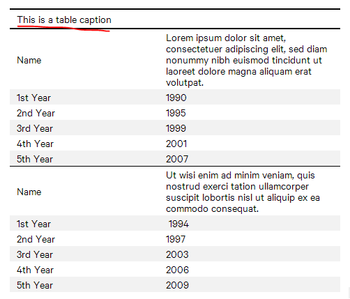
Initially responsive tables plugin was based on pure CSS implementation transposing table from table view into a block stacking cells vertically. Solution based on CSS rules is good enough to reduce markup and style tables based on style sheets. However this approach seems to be not really reliable. For me as back-end developer CSS seems to be one of the most fragile thing on the web – any browser, any device and any device + screen size combination may render your stat-of-art web page unpredictably. The same case came to responsive tables when it comes to render stacked table based on CSS rules on some smaller devices and different browsers.
Therefore we decided to switch from CSS styles to transposed table in hard way – generating new markup for existing table transposing every table cell. Plugin relies on proper table layout and semantic markup. Our solution is heavily based on stacktable.js by John Polacek.
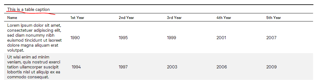
Make table responsive
As an editor you need to make sure following things are done for your responsive table.
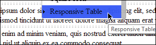
1) Mark your table as responsive.
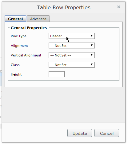
2) Define table header (thead).
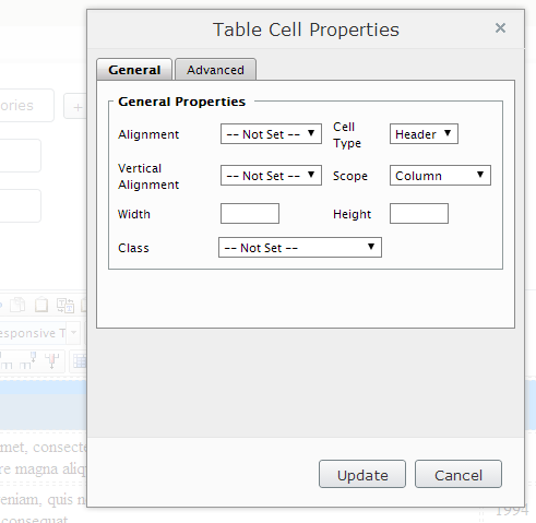
3) Define table header cells for appropriate columns.
As a developer you need to:
1) Include responsive-table.js (found here). 2) Include responsive-table.css (found here).
And any table that is attributed with responsive class transpose:
1
$(‘table.responsive’).stacktable();
Update
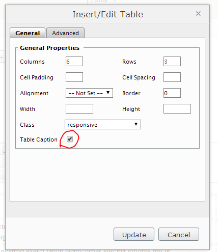
New version of responsive tables now support also a table captions (originally supported by EPiServer tinyMCE editor, but left out from original plugin by John Polacek).
Source code
Source code could be found @ Geta AS GitHub.
Happy coding!
[eof]
Comments powered by Disqus.