Responsive EPiServer Tables
Whenever you need to represent data on the website in table format question about responsiveness and page look & feel on smaller devices arise.
I found an interesting solution @ CSS Tricks for transforming tables from column-based into row-based on smaller devices.
This blog post is about how to adapt and automate a bit solution to fit for tables created by EPiServer tinyMCE editor.
Even if we specify that table has header and body:
Markup structure for table is following:
1
2
3
4
5
6
7
8
9
10
11
12
13
14
15
16
<table>
  <thead>
    <tr>
      <td>Name</td>
      <td>1st Year</td>
      ...
    </tr>
  </thead>
  <tbody>
    <tr>
      <td>..</td>
      <td>..</td>
      ...
    </tr>
  </tbody>
</table>
So you can see that table has only thead element without proper th elements. That’s actually is not a problem at all.
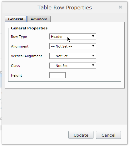
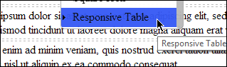
Add additional tinyMCE class
You can try to convince editors to change markup directly – good luck! We would need to add additional class to tinyMCE editor in order to be able to mark table to act responsive on smaller screens just by adding special style for table using editor’s dropdown box. We can add simple class to editor.css file:
1
2
3
.responsive {
    EditMenuName: Responsive Table;
}
EPiServer needs to know about our editor.css file. You can configure (if not done already) EPiServer to pick-up this custom CSS file for showing styles in tinyMCE editor Styles drop-down in episerver.config file:
1
2
3
<episerver>
  <applicationSettings uiEditorCssPaths="~/Static/css/Editor.css" ... />
So now you are able to mark table to be responsive.
Add metadata to the table
As second step we need to decorate table with a bit more metadata that will be used later by CSS. We are inspecting table structure, extract count of columns, pick up appropriate thead row and add data- attribute to every row.
1
2
3
4
5
6
7
8
9
10
11
12
13
14
15
16
17
18
19
20
21
22
23
24
25
26
27
28
29
30
// responsive tables
$(function() {
    $(‘table.responsive’).each(function() {
        var $table = $(this),
        $thead = $table.find(‘thead’),
        $tbody = $table.find(‘tbody’);

        // get column count from 1st row in the body
        var columnCount = $tbody.find(‘tr:first-child td’).length;

        // extract column titles
        var titles = new Array();

        $thead.find(‘tr’).each(function() {
            var $cells = $(this).find(‘td’);

            if ($cells.length == columnCount) {
                $cells.each(function(ix, el) {
                    titles[ix] = $(el).html();
                });
            }
        });

        $tbody.find(‘tr’).each(function() {
            $(this).find(‘td’).each(function(ix, el) {
                $(el).attr(‘data-title’, titles[ix]);
            });
        });
    });
});
After script has been executed we will end up with similar markup:
1
2
3
4
5
6
7
8
9
10
11
12
13
14
<table border="0">
  <tbody>
    <tr>
      <td>Name</td>
      <td>...</td>
      ...
    </tr>
    <tr>
      <td>1st Year</td>
      <td>..</td>
      ...
    </tr>
  </tbody>
</table>
To pick up proper row from thead is needed to support tables with merged cells acting as caption for the table.
Style row-based table
Final step is to add proper CSS to transform table from column-based into row-based table on smaller devices.
1
2
3
4
5
6
7
8
9
10
11
12
13
14
15
16
17
18
19
20
21
22
23
24
25
26
27
28
29
30
31
32
33
34
35
36
37
38
39
40
41
42
43
44
45
46
47
table {
  table-layout: fixed;
}

table tbody tr:nth-child(even) {
  background-color: #f2f2f2;
}

@media (max-width: 767px) {
  table.responsive,
  table.responsive thead,
  table.responsive tbody,
  table.responsive th,
  table.responsive td,
  table.responsive tr {
    display: block;
  }

  table.responsive thead tr {
    position: absolute;
    top: -9999px;
    left: -9999px;
  }

  table.responsive td {
    border: none;
    border-bottom: 1px solid #eee;
    position: relative;
    padding-left: 35%;
    white-space: normal;
    text-align: left;
    width: 100%;
    font-size: 14px;
  }

  table.responsive td:before {
    position: absolute;
    top: 6px;
    left: 6px;
    width: 30%;
    padding-right: 10px;
    white-space: nowrap;
    text-align: left;
    font-size: 14px;
    content: attr(data-title);
  }
}
Using following styles table that is marked to be responsive using tinyMCE editor will break apart and transform itself into row-based table on screens smaller than 768px wide (particularly on ordinary mobile phone).
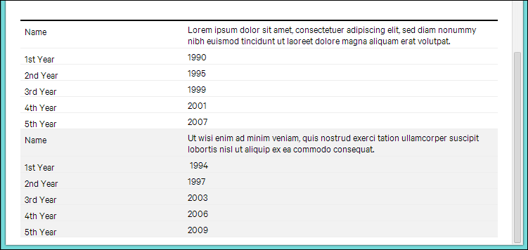
Demo
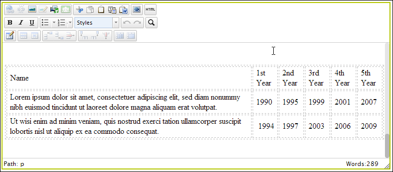
On screen with 800px width:
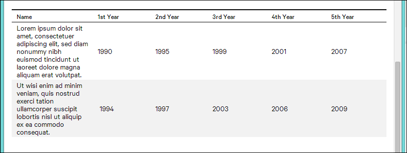
On screen less that 768px width:
Happy responsive designing!
[eof]
Comments powered by Disqus.